
Enhancing Your Home’s Value with Color Scheme Consistency
When we start talking about getting your home ready for sale, one of the first things I hear from homeowners is, “Should I repaint? And if so, what colors should I choose?”
That’s a good question, choosing colors can be overwhelming. Most homeowners think the answer is just to fix the obvious flaws, like touching up the scuffs or covering that old accent wall. But here’s the thing
it’s not just about what you fix but how it all comes together.
I always say, think beyond individual repairs. We will fix all the problems. Those are the easy tasks to sell.
Ask yourself, “What will buyers see and feel when they walk through the door?” That’s why starting with a cohesive color scheme isn’t just a cosmetic touch—it’s a strategy to create a lasting first impression that helps your home stand out and sell faster.
Believe me, I know it’s tempting to throw in a pop of your favorite color or create that bold accent wall you’ve always dreamed of. Now is not the time. Save those ideas for your next home.
Right now, it’s about showing buyers a neutral, inviting space where they can imagine their own style. Bringing in your personal flair might look amazing, but it’s risky. You never know what a buyer will think, and most of the time, what works for you might not work for them.
Remember, our goal is to appeal to the broadest group of people, and that starts with giving them a neutral palette that feels welcoming and versatile.
The Concept of Color Coordination
Color scheme consistency is a strategic approach where a single accent color is echoed throughout various elements of your home. Imagine gold: it’s not just a color but a statement. By integrating gold in lighting, faucets, and cabinet hardware, you create a cohesive narrative in your space. Combined with a neutral background color, the accents show like jewelry.
Classic three-layer color palette design
the three-layer approach creates a balanced and harmonious color scheme in interior design. The use of a neutral base allows for flexibility, the middle layer adds substance and depth, and the accent layer introduces personality and visual interest, ensuring that the space feels dynamic yet cohesive.
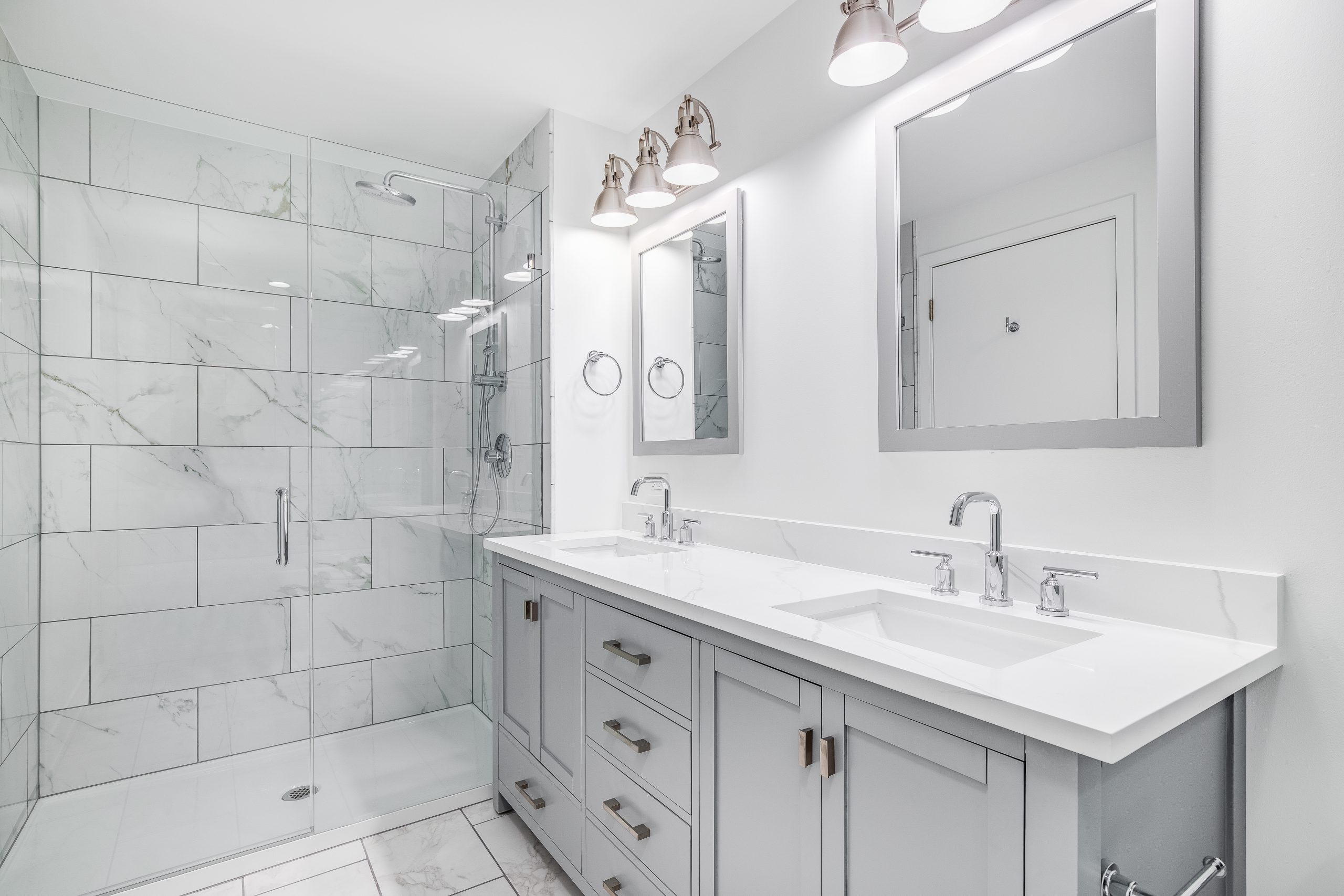
- Base Layer – Neutral Walls: The walls, painted in a white, light grey, beige, or greige (any combination of grey and beige) serve as the neutral base layer. This choice sets a calm, unobtrusive backdrop for the room. Light grey is an excellent foundation as it’s versatile and timeless, providing a subtle canvas that allows other colors to stand out without causing visual clutter. Lighter colors also make the rooms feel larger.
- Middle Layer – Cabinets and Countertops: The kitchen cabinets, countertops and backsplashes represent the middle layer. This layer is crucial as it breaks the monotony of the neutral walls. By choosing colors and materials that contrast with the light grey, yet still complement it, you add depth and interest to the space. This layer often includes richer or darker tones that provide a sense of warmth or coolness, depending on the chosen palette. Wainscoting is another option to add detail to the medium layer.
- Accent Layer – Fixtures, Lights, and Hardware: The final layer consists of fixtures, lights, and hardware, which bring in the accent colors. These elements are key to injecting style and flair into the room. Accent colors are typically luxurious, bolder, more vibrant. Used sparingly to create focal points and add character to the space. They draw the eye and provide a dynamic contrast to the more subdued colors of the first two layers.
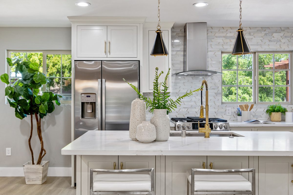
The kitchen above highlights the impact of a cohesive color scheme with light grey walls, white cabinets and gold accents.
Benefits of a Consistent Color Scheme
Use Staging Furniture to Define The Home’s Style
Every home has a specific type of buyer in mind. For example, urban condos tend to attract young professionals, while families are usually drawn to homes in the suburbs.
The tricky part is that each of these groups has its own style and preferences. So instead of using bold colors on the walls or choosing trendy countertops that might only appeal to some, I always recommend keeping the background neutral.
We can use staging furniture and décor to set the right tone and create the look buyers are drawn to. This approach lets us highlight the home’s best features and tap into what feels right to them. Without risking turning them off with design choices that don’t match their tastes and are hard to change
How to Start
Step 1: Understand the Target Buyer
I know your excited about getting started, but there are some pre-requisites that need to address first.
Before choosing any colors, it’s essential to know who is likely to buy your home. Ask yourself these questions:
- Is the home located in an urban area, a suburb, or a rural setting?
- Will it appeal more to families, young professionals, or retirees?
- Are the typical buyers looking for something modern, classic, or cozy?
Once you know who your potential buyers are, you can tailor your choices to match the general preferences of that group.
Of course a real estate agent will be able to provide this information.
Step 2: Start with a Neutral Base Palette
To make the home feel welcoming to the widest range of buyers, start with a neutral base. Think shades like soft grays, creamy whites, or warm beiges. These colors create a versatile backdrop and help make spaces feel brighter and more spacious.
- Living Areas & Bedrooms: Stick to light neutrals—off-whites, pale grays, or warm beige.
- Bathrooms: Go slightly warmer to create a spa-like feel, using colors like light taupe or soft ivory.
- Kitchens: Soft gray or white works best, allowing cabinets and countertops to be the focus.
Before you buy the paint, get several samples of a color in slightly different tones. Paint stores now offer colored sheets. The advantage of colored sheets is that you can move them around to all the walls.
You’d be surprised how different lighting will effect the color of the paint. See the samples on well lit walls and walls that are in the shadows.
Step 3: Choose One or Two Subtle Accent Colors
Select one or two accent colors to use sparingly throughout the home. These should be understated hues that complement the neutral base without overwhelming the space. Think muted blues, sage greens, or soft blushes. These accents can be brought in through small elements like throw pillows, art, or even a statement piece of furniture.
Step 4: Decide on the Style of Staging Furniture
Choose a staging style that appeals to your target market. Here’s a quick guide:
- Young Professionals: Opt for modern and sleek furniture—clean lines, minimalist décor, and a few pops of metallic accents.
- Families: Go for a transitional style—comfortable, inviting furniture, with soft fabrics and a few traditional pieces to make the space feel cozy.
- Retirees: Lean towards classic and elegant—plush seating, subtle patterns, and a few touches of sophistication like dark woods or marble finishes.
Conclusion
Color scheme consistency is a simple yet effective way to elevate your home’s perceived value. Whether it’s bold gold or serene blue, the right accent color can make a world of difference. Remember, in the realm of home buyer emotions, sometimes, it’s the smallest details that make the biggest impact.