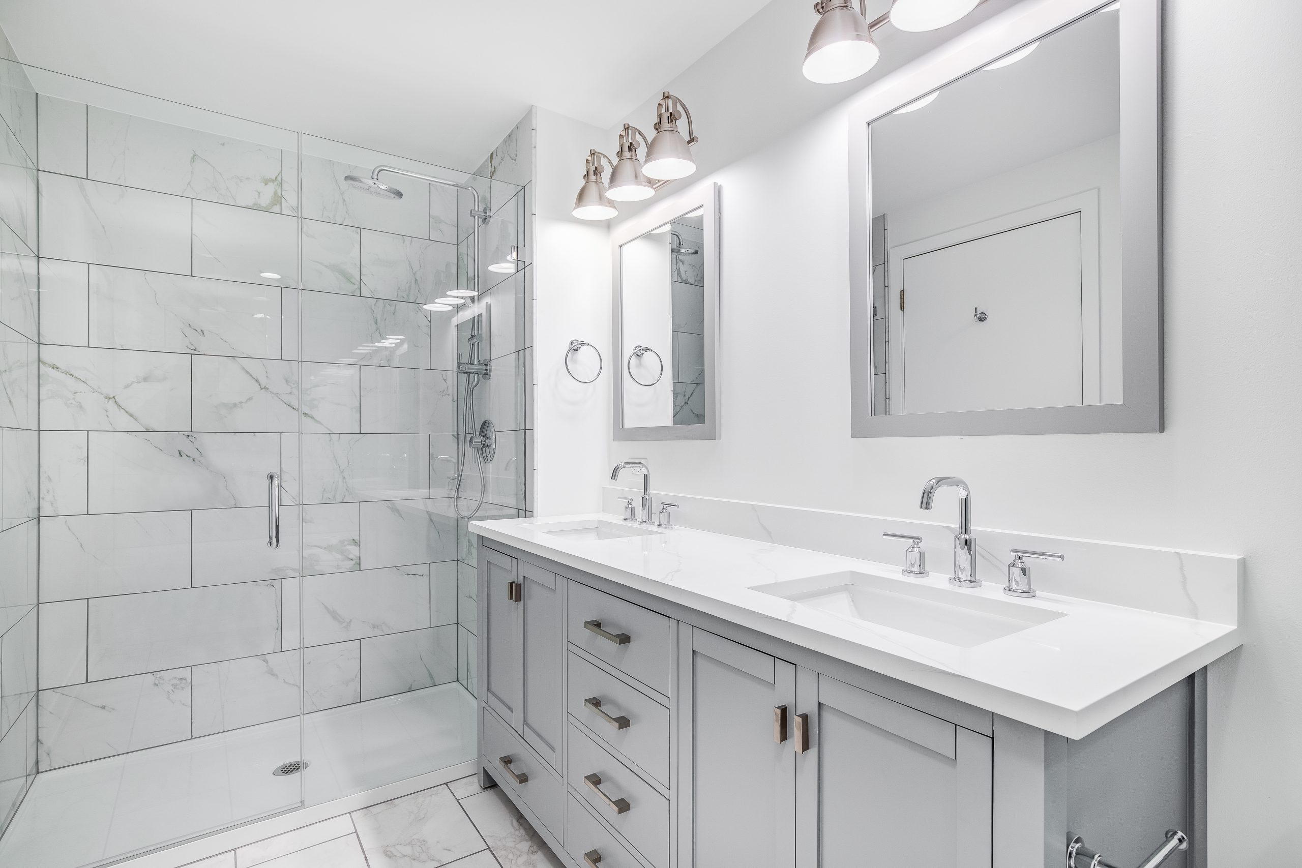

Creating Contrast and Variety in Design for a Welcoming Home

A client of mine, an experienced real estate investor, recently faced a challenge. He had meticulously remodeled a property, yet it wasn’t selling. Seeking my advice, he called to understand why his investment wasn’t paying off.
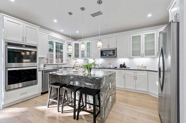
Upon reviewing the property, I noticed a critical issue. There is no contrast and variety. The overwhelming dominance of dark stone gray. The floor, countertops, and backsplashes all shared this somber hue. This created a monotonous and uninviting atmosphere. Potential buyers couldn’t envision themselves in such a dreary space.
To address this, I recommended introducing contrast and variety in design. The stylish countertops could remain. However, the floor and backsplashes needed a transformation. This would reduce the emphasis on the dark stone gray and add warmth to the home.
We chose modern wood laminate flooring. This brought much-needed lightness and a neutral backdrop that allowed the countertops to stand out. For the backsplashes, we opted for white textured tile. This added depth and interest, complementing the existing countertops. These subtle changes transformed the kitchen from monotonous to modern.
With these adjustments, the investor listed the home. It sold quickly. This experience highlights the importance of using contrast and variety in design to create an inviting space that feels like home.
Implementing Contrast and Variety
Understanding Contrast and Variety:
- Contrast: Juxtapose different elements to create visual interest through differences in color, texture, shape, and size.
- Variety: Ensure these differences keep the design from feeling repetitive or boring.
Using Background and Accent Colors:
- Background Colors:
- Choose neutral tones like whites, grays, or beiges for large areas.
- Slight variations in these tones add depth.
- Accent Colors:
- Use bold colors for smaller elements to draw attention and add personality.
- Distribute accent colors evenly to maintain balance.
Using Foreground Colors and Textures:
- Highlight specific features with foreground colors.
- Incorporate different textures to add interest, like pairing smooth countertops with textured backsplashes.
Avoiding a Bland Interior:
- Introduce contrasting colors to break monotony.
- Mix materials like wood, metal, and fabric to create a rich, layered look.
Practical Examples
- Living Room:
- Use light gray or beige for walls and a darker tone for flooring.
- Mix materials in furniture and add colorful accents.
- Kitchen:
- Keep countertops neutral and add contrast with dark wood or colored cabinets.
- Use unique light fixtures to draw the eye upwards.
By thoughtfully applying contrast and variety, homeowners can create a balanced, inviting, and visually stimulating environment. This approach enhances aesthetic appeal and ensures the home feels personalized and welcoming.